Goals and objectives.
Tap & Fork is an application that allows people to find restaurants. Conceptually it is similar to applications like Yelp, OpenTable or Zomato, Tap & Fork is built to address some of the shortcomings of the existing applications to make the pricing strategy more attractive to restaurant owners and to allow them to fully control their marketing campaigns. With Tap & Fork, restaurant owners can easily upload images, create coupons, and run promotions.
Tap & Fork has a website where restaurant owners could build promotions that would be run for specified time intervals, add coupons, and create custom images with a simple and easy-to-use web based graphic editor.
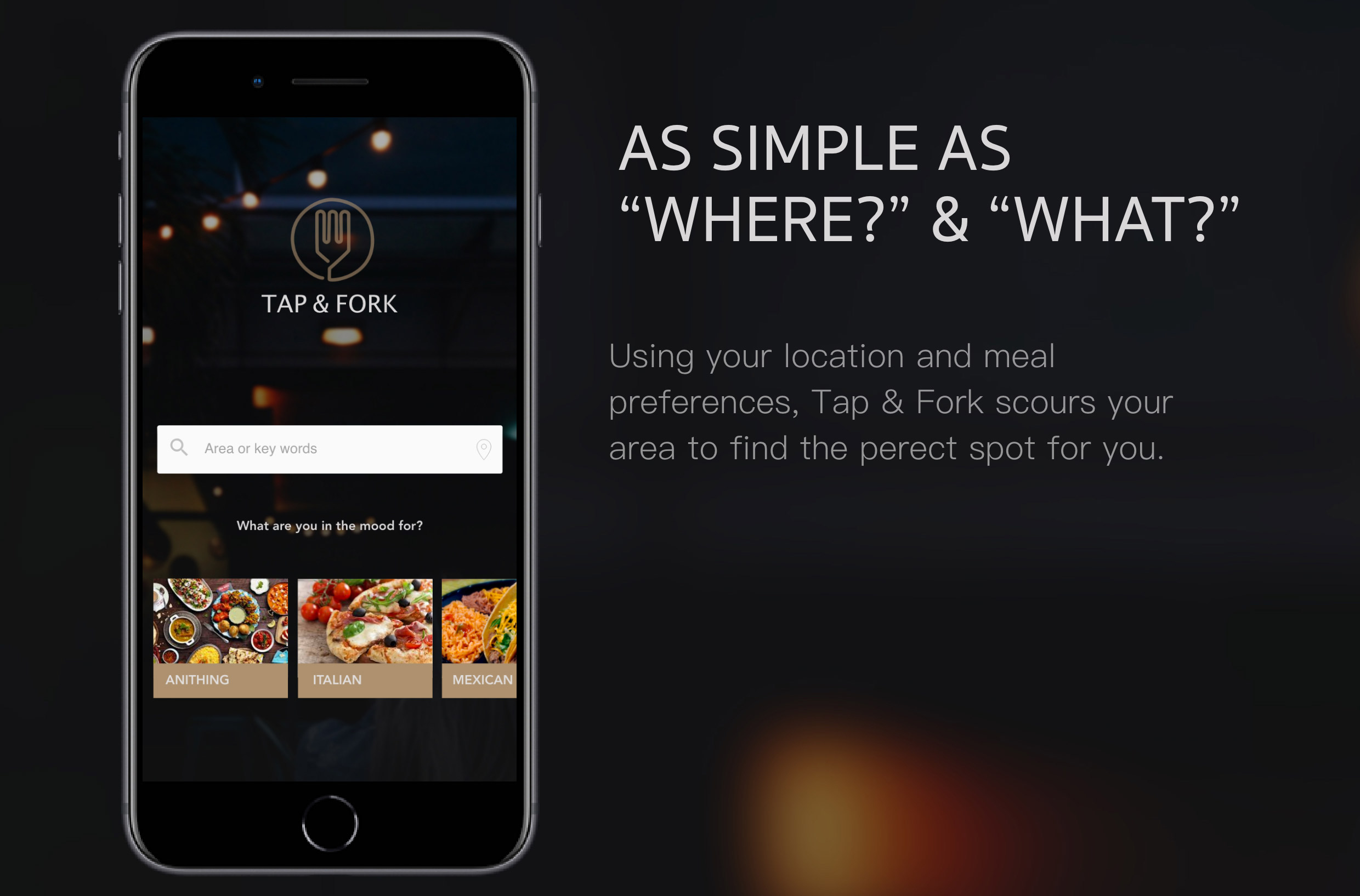
Customers use the Tap & Fork mobile application, which features nearby restaurant search. The Tap & Fork mobile application design is what I worked on.
USER objectives:
- Locate nearby restaurants that offer the preferred type of food
- Take advantage of the restaurant promotions, specials and coupons
- Call to make a reservation
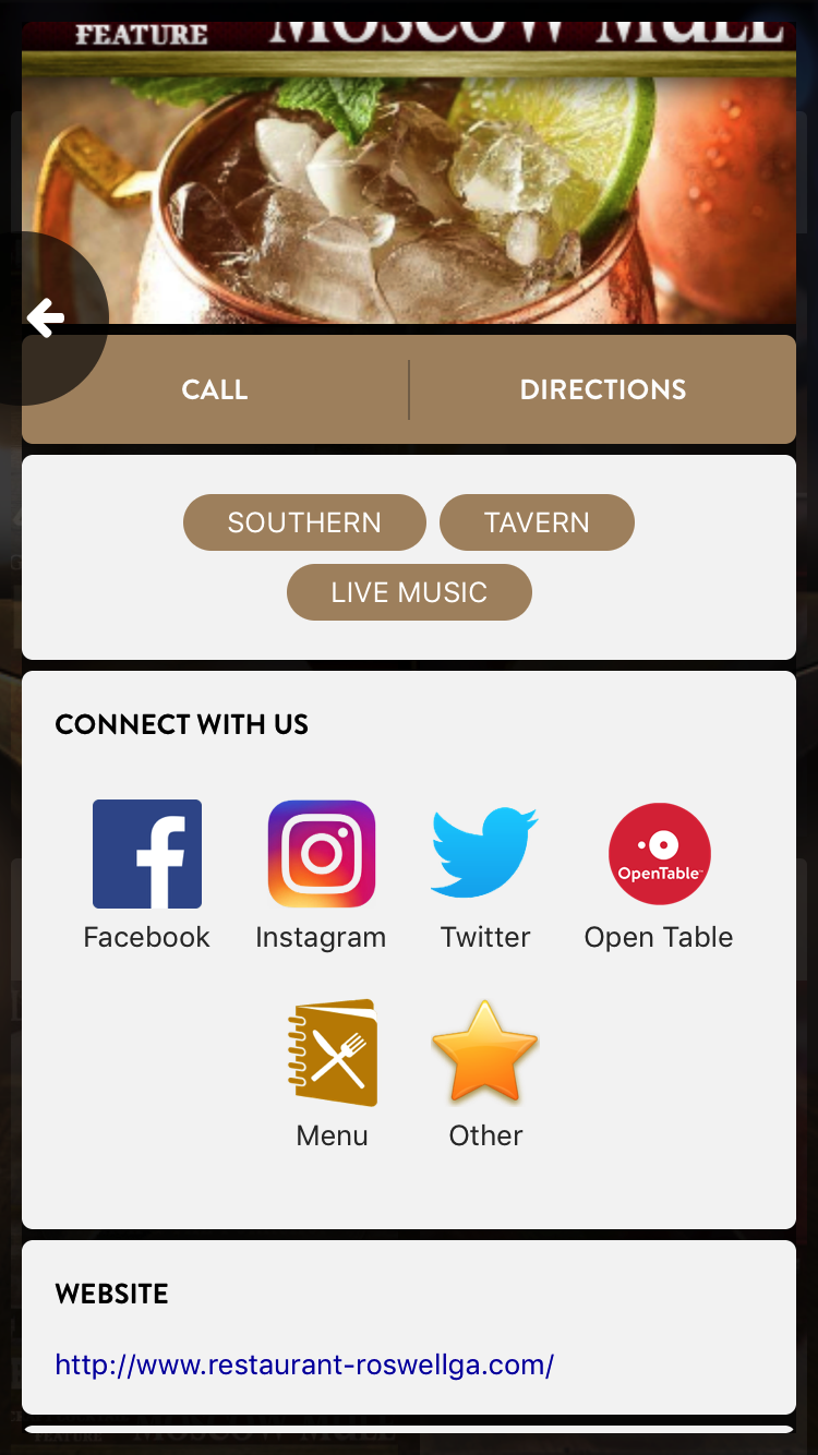
- Navigate to the restaurant website and social media content
- Get directions
- Be able to rate the restaurant and have access to other customer ratings
RESTAURANT owner needs:
- Affordable listings
- Have full control over the restaurant advertising
- Be able to publish new images and specials with a single click
- Be able to create new promotions and coupons
- Be able to control promotion time windows
T&F goals
- Get 1000 active users within 3 month
- Get restaurants to sign up and customize their accounts
- Attract bigger investors for future development
Research and competitor analysis


At the beginning of the project we ran a series of user testing trying to find out what people are looking for in such an application, and how existing applications come short. One of the biggest issues reported by users was the amount of information surfaced by most of the popular applications: when applications displays the list of restaurants that match the search criteria the listed restaurants would surface too much information to parse through. At the same time the images of restaurants in the list were too small making it difficult to see the unique features and the spirit of each restaurant.
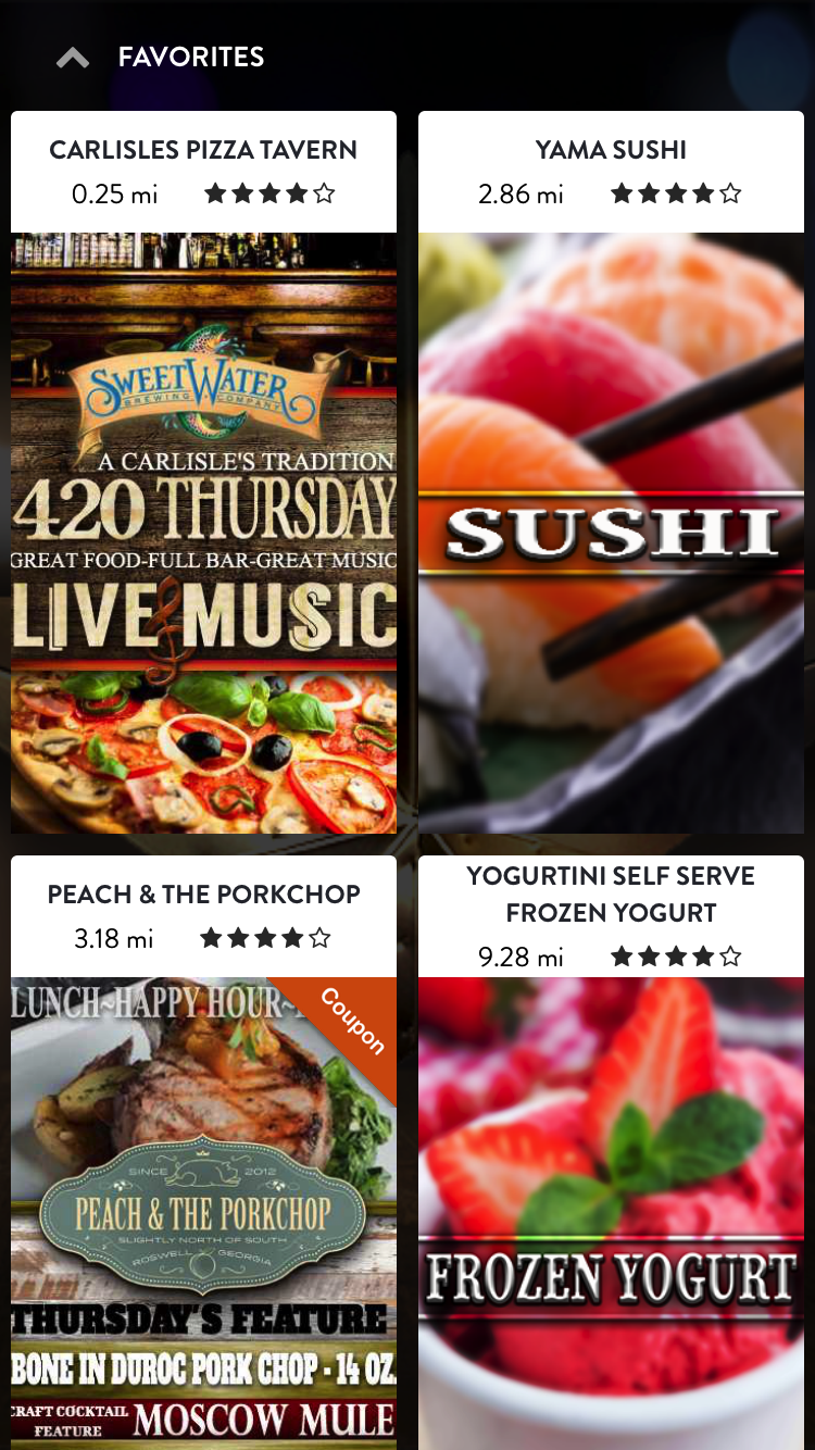
Our solution to that problem was to reduce the amount of the information presented in the restaurant list focusing on the image that would show each restaurant unique features.
We have received a very strong positive user feedback.
Mobile app futures
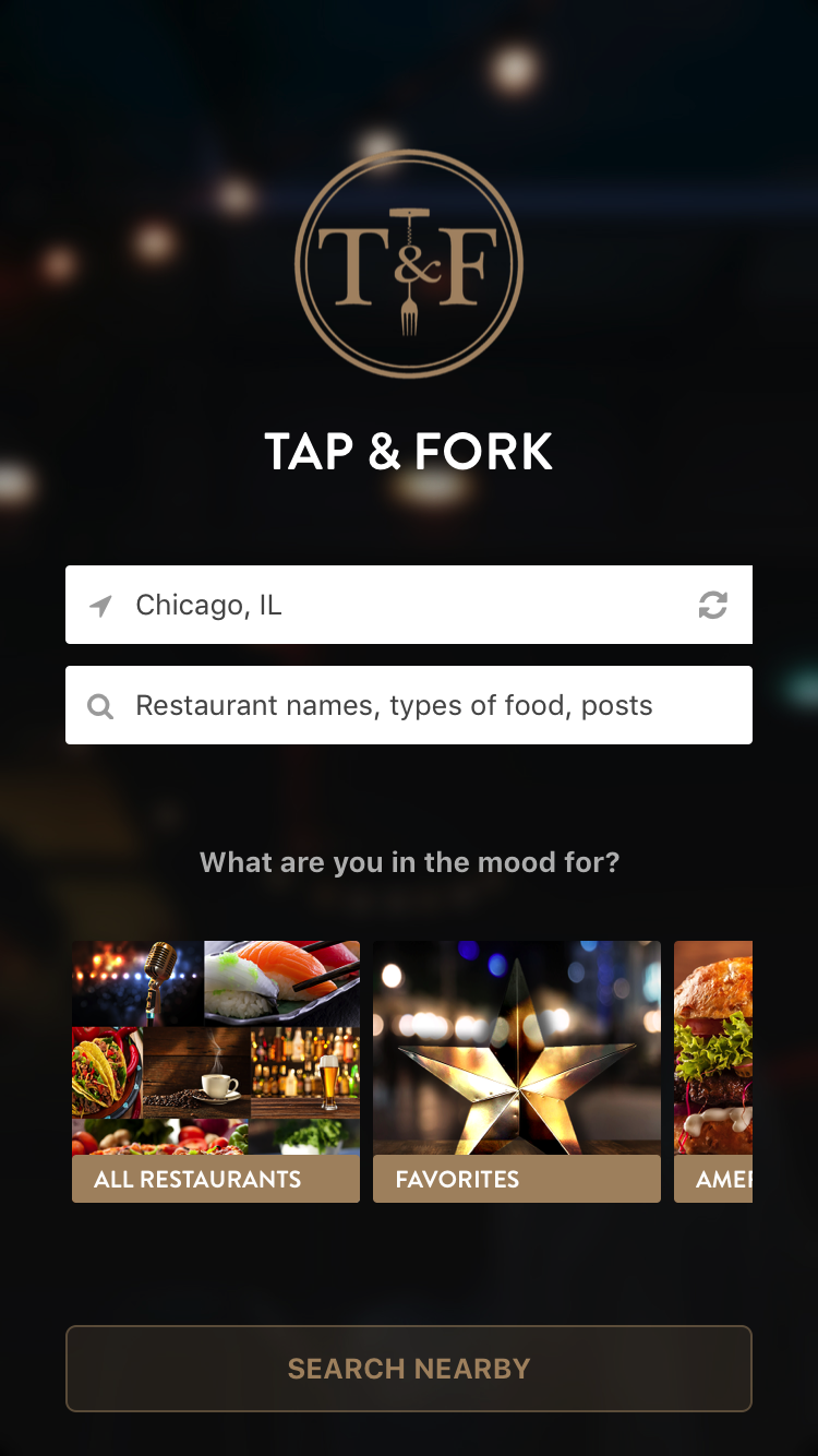
- Search for distance, type and keyword
- Listing of graphic ads
- Call button and direction button
- Gallery for each restaurant
- Star rating
- Favorites
- Sample placeholders and Google images for non-subscribed restaurants
Mobile app flowchart

Prototype
Solutions
In addition, we are particularly proud of these details:
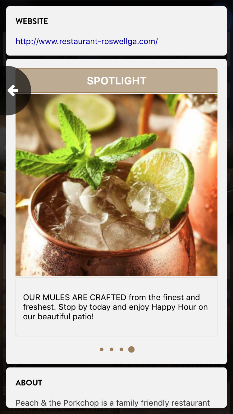
- The ability to have 4 restaurants on one mobile screen. Image size is very important for pleasant scroll and prevents users from feeling bombarded with information (my idea)
- Infinite scroll loads quickly
- Google data is used before restaurants customize their business account (my idea)
- Brilliant images

